From Corporate to Constructive
Pankow Builders Brand Identity Refresh
Challenge
Pankow’s legacy was strong—but its logo wasn’t speaking the same language. Literally.
For years, people mispronounced the name (“Pan-cow” instead of “Pan-ko”), and a previous attempt to fix the issue by coloring the final “O” differently only drew more awkward attention to it. Our research showed the visual band-aid confused audiences and compromised the mark’s aesthetic integrity without solving the root problem.
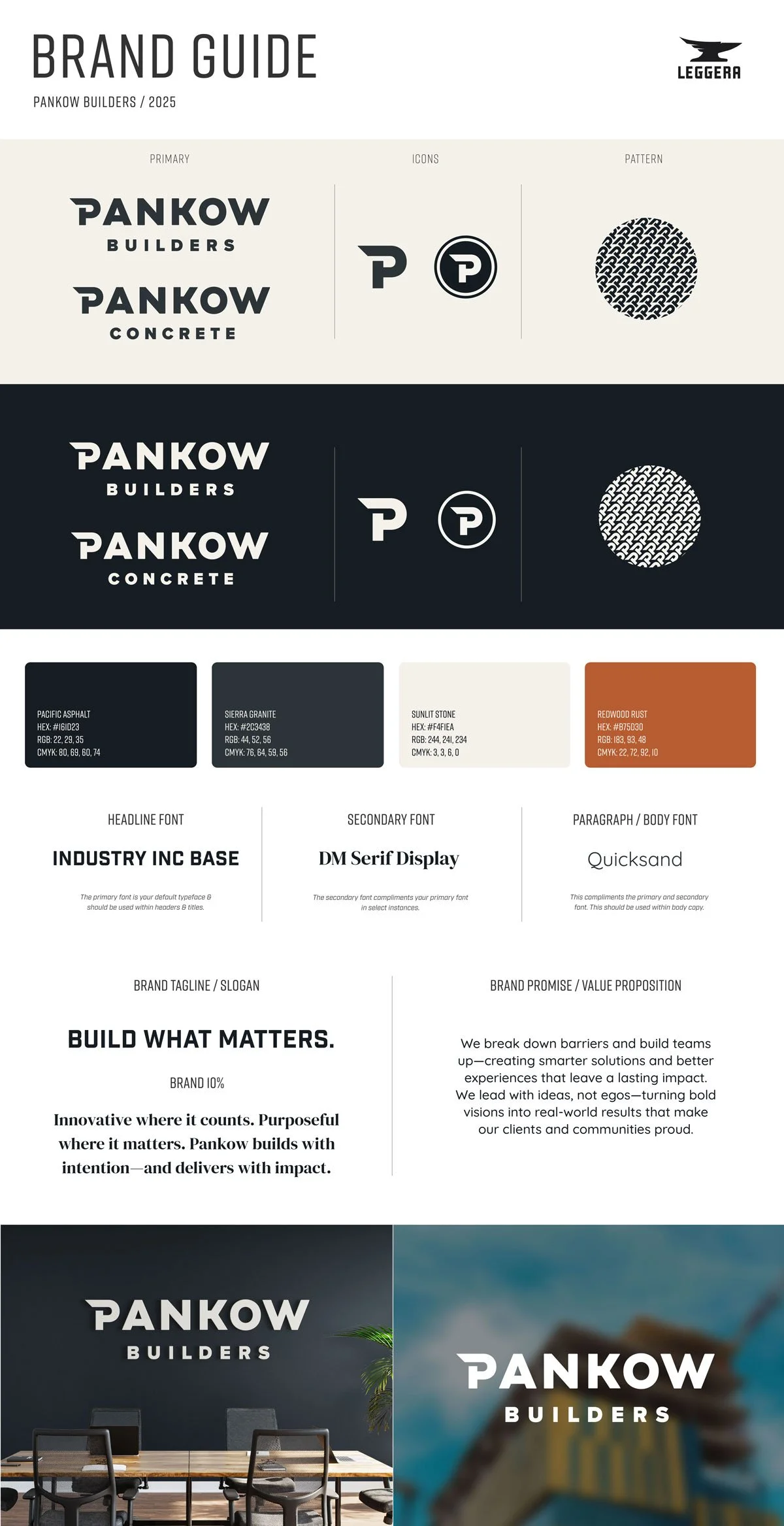
At the same time, the word “Builders”—once part of the original name—had quietly disappeared from the logo over time. That omission weakened one of Pankow’s greatest differentiators: its ability to self-perform and build with true craftsmanship. The rebrand needed to restore that identity—to re-center Pankow as hands-on builders, not just managers of construction.
Approach
We took a clean-sheet approach—balancing reverence for a six-decade legacy with the confidence of a modern builder. The first move was restraint: we abandoned the idea of visually “teaching” pronunciation and focused instead on timeless form and proportion. A name earns clarity through reputation, not color tricks.
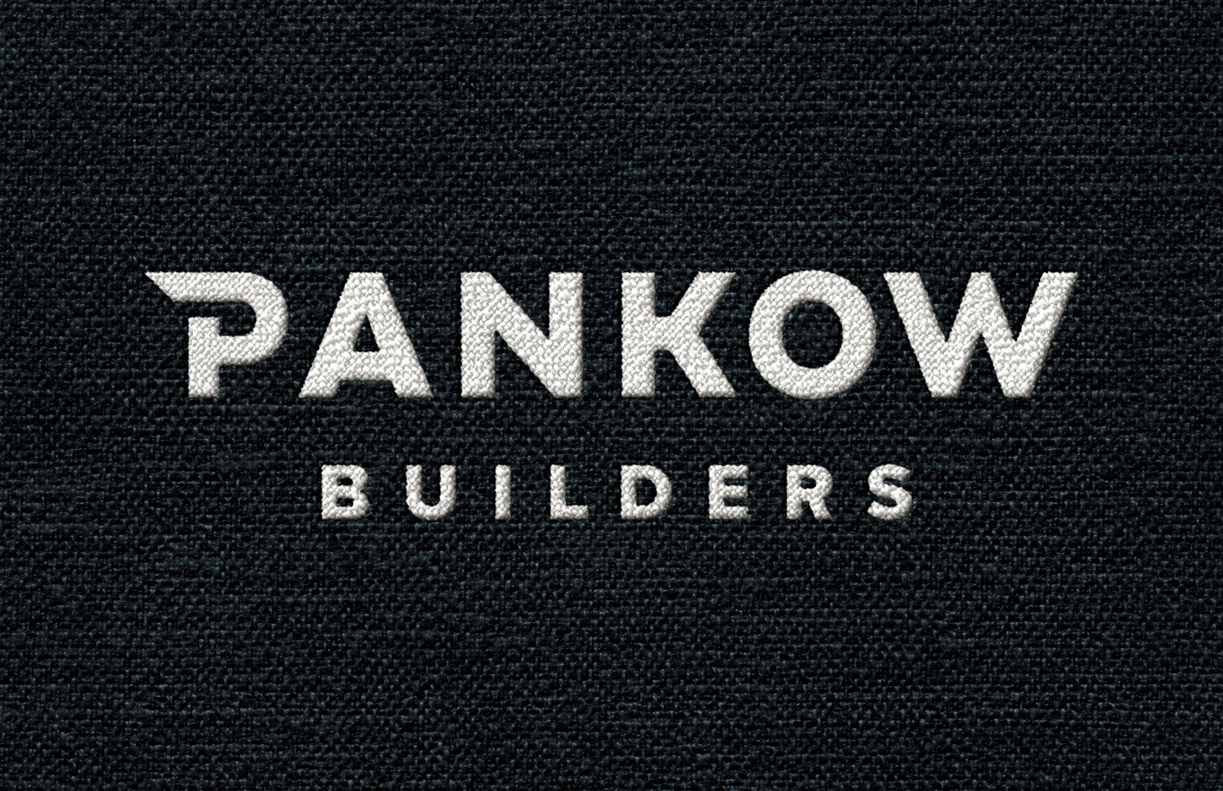
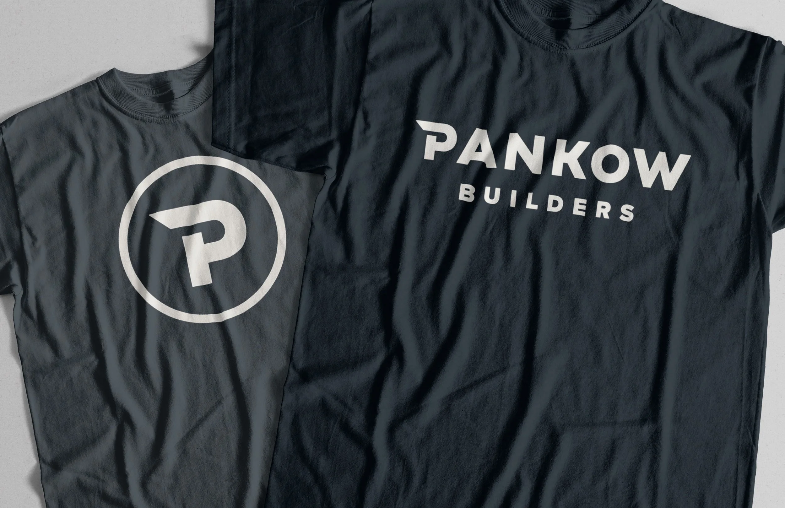
From there, we rebuilt the wordmark with a stronger architectural presence—streamlined geometry, refined spacing, and a renewed sense of craft. Reintroducing “Builders” into the lockup grounded the name in what Pankow truly is: hands-on innovators who both design and construct.
Our exploration was deep and deliberate. Dozens of directions were sketched, refined, and tested—each one a strong contender in its own right. The final mark emerged not by default, but by consensus—a balance of confidence, longevity, and quiet authority that simply felt inevitable once seen.
Tone, color, and typography were rebuilt from the ground up. The palette draws from California’s materials—Pacific Asphalt, Redwood Rust, and Sunlit Stone—and pairs modern sans-serif utility with the warmth of serif headlines. The new tagline, “Build What Matters,” captures Pankow’s mindset of purpose-driven construction and human impact.

Unused Concepts
Multiple strong contenders showed the breadth of Pankow’s visual potential. Which do you prefer?
Outcome
The result is a confident, enduring identity that feels both modern and inevitable. It restores balance between legacy and leadership—evolution without reinvention.
Born from exploration and consensus, not compromise, the final mark captures who Pankow truly is: builders of ideas, teams, and trust. It’s refined enough for architects, bold enough for builders, and built to last.
Impact
The rebrand reignited pride across Pankow’s teams and modernized its perception across the AEC industry. The new system reflects a company grounded in trust and driven by collaboration—a Master Builder with modern vision.
Brand 10%
Innovative where it counts. Purposeful where it matters. Pankow builds with intention—and delivers with impact.Brand Promise
We break down barriers and build teams up—creating smarter solutions and better experiences that leave a lasting impact. We lead with ideas, not egos—turning bold visions into real-world results that make our clients and communities proud.


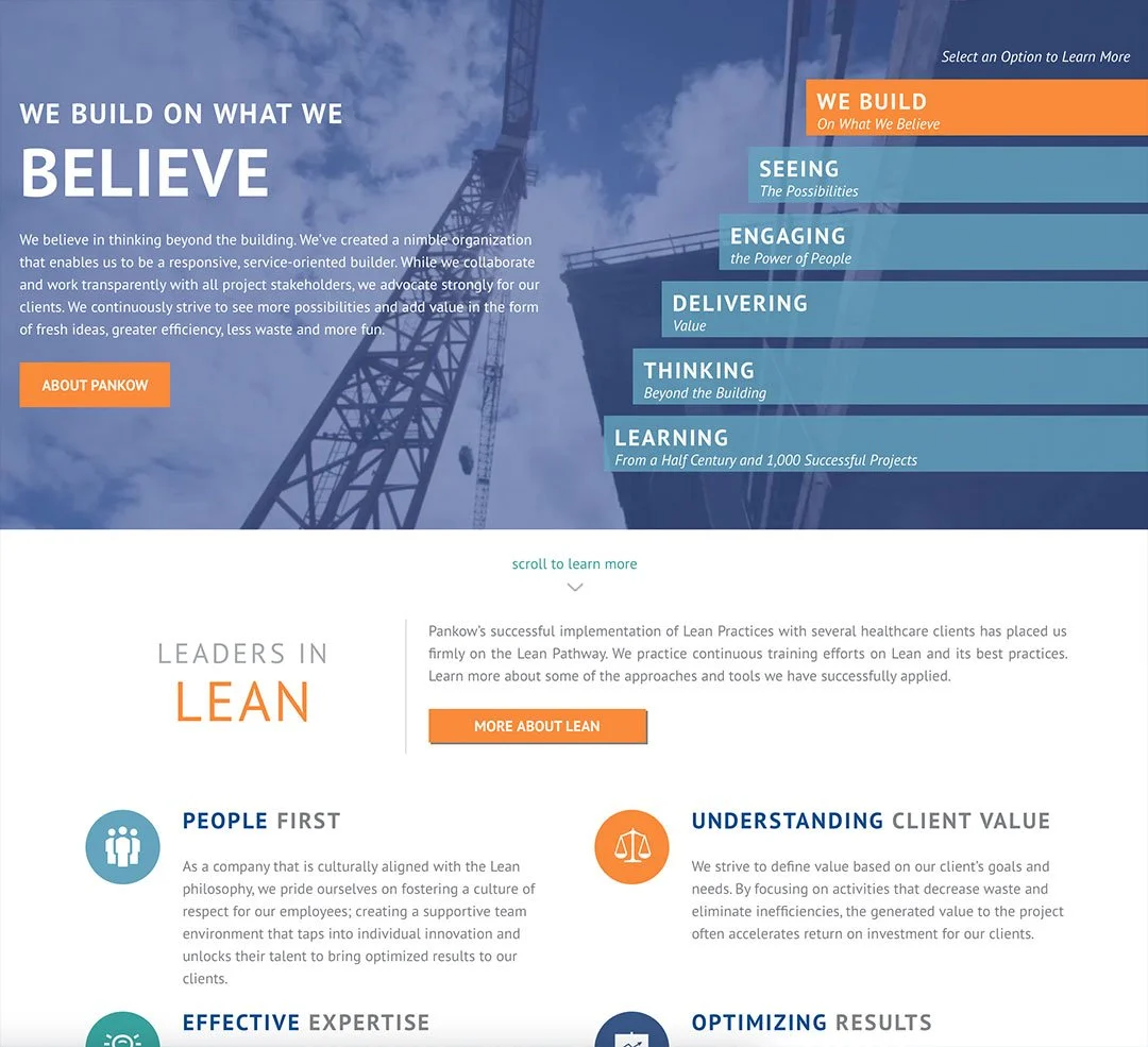
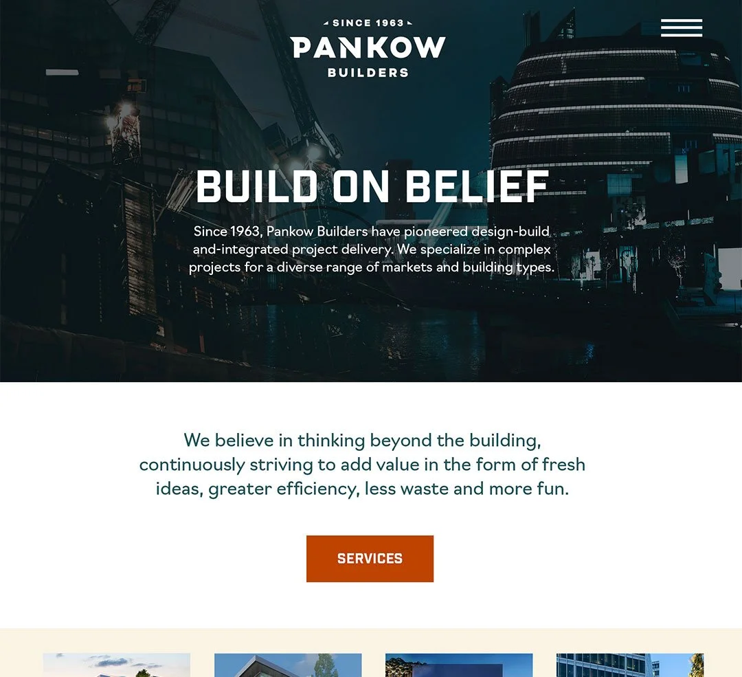
Redesign of Pankow.com
We later partnered with Pankow to infuse newly defined brand direction into a fresh website structure—demonstrating what’s possible for a large, complex design-build firm. The work focused on creating a clear, flexible foundation that could support multiple audiences while bringing order to a lot of moving parts.
Our UX approach typically favors less copy, clearer paths, and punchier calls to action—helping visitors quickly understand where to go and why, without asking them to read a novel. That philosophy shaped the site’s structure and journeys from the start, keeping things as clean and intuitive as possible.
As is common in the AEC world, Pankow’s internal team took a more active role in shaping content and page flow later in the process. That collaboration introduced a denser, more industry-insider voice—something many firms at this scale are comfortable with. Even so, the underlying structure reflects how we work today: leading with simplicity, advocating for restraint, and designing systems that still hold together as content grows. The goal isn’t to control every word, but to make sure the experience stays navigable, purposeful, and effective.