From Gritty Passion to Purposeful Precision
Raven Contracting Brand Identity & Messaging Refresh
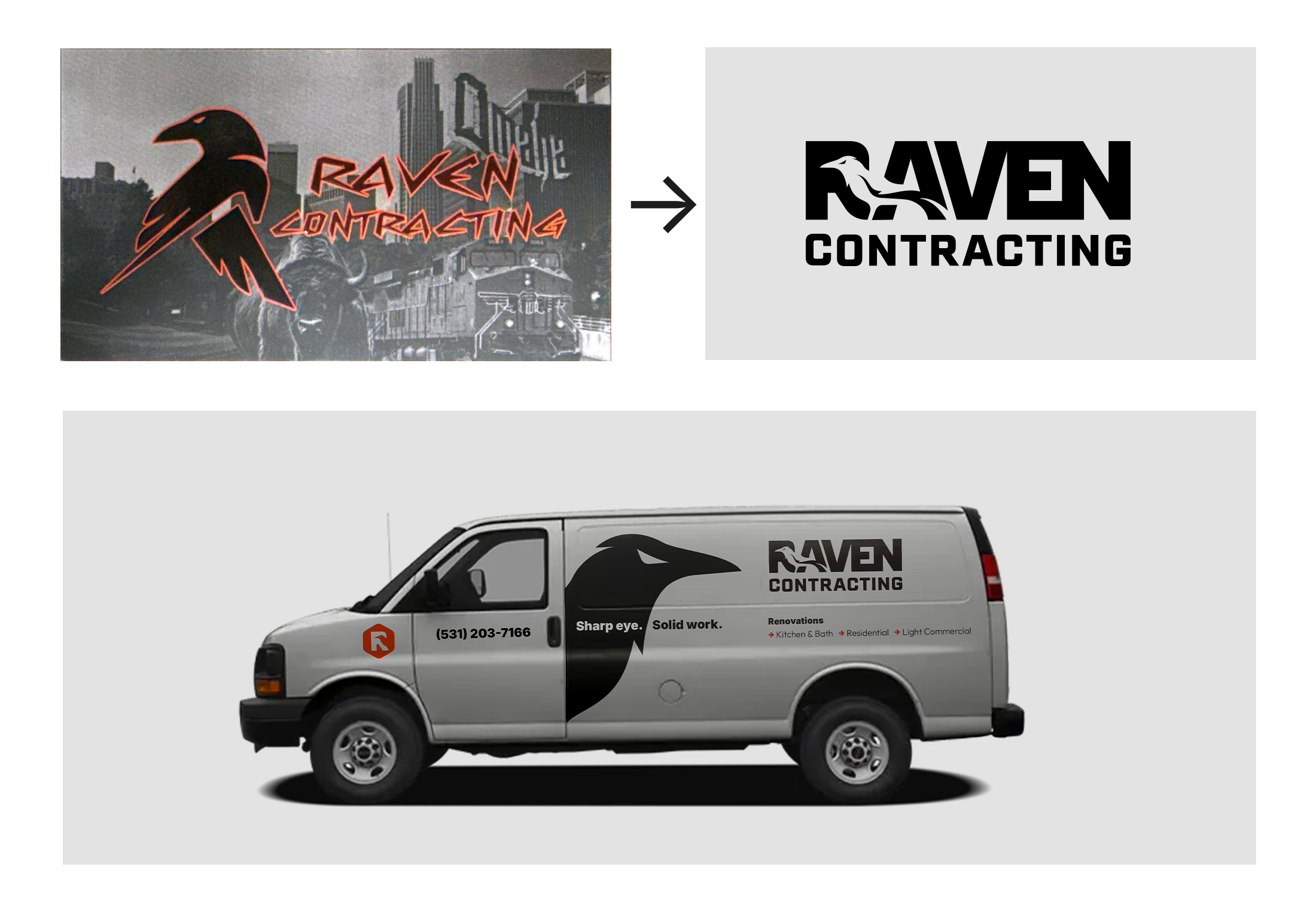
Challenge
Raven’s previous brand had heart—lots of it. The original logo leaned into a bold, almost graffiti-like aesthetic: a sharp, angular raven silhouette paired with distressed lettering, overlaid on imagery of Omaha landmarks. It communicated intensity, hustle, and a certain “we get after it” energy.
But it also created challenges.
The style was inconsistent across uses, the lettering was difficult to read at smaller sizes, and the overall composition felt more like a custom decal than a scalable identity system. The raven mark itself had personality, but its proportions and line work made it hard to apply cleanly on uniforms, trucks, invoices, and digital platforms.
As Raven matured—taking on bigger projects and building a reputation for sharp attention—the brand needed to evolve with it. The goal wasn’t to erase the original spirit; it was to harness it, refine it, and communicate Raven’s craft with the clarity their work already deserved.
Approach
We started by honoring what was already there: grit, pride, and a bird with attitude. Those qualities mattered. But they needed structure—something that could carry the brand into its next chapter.
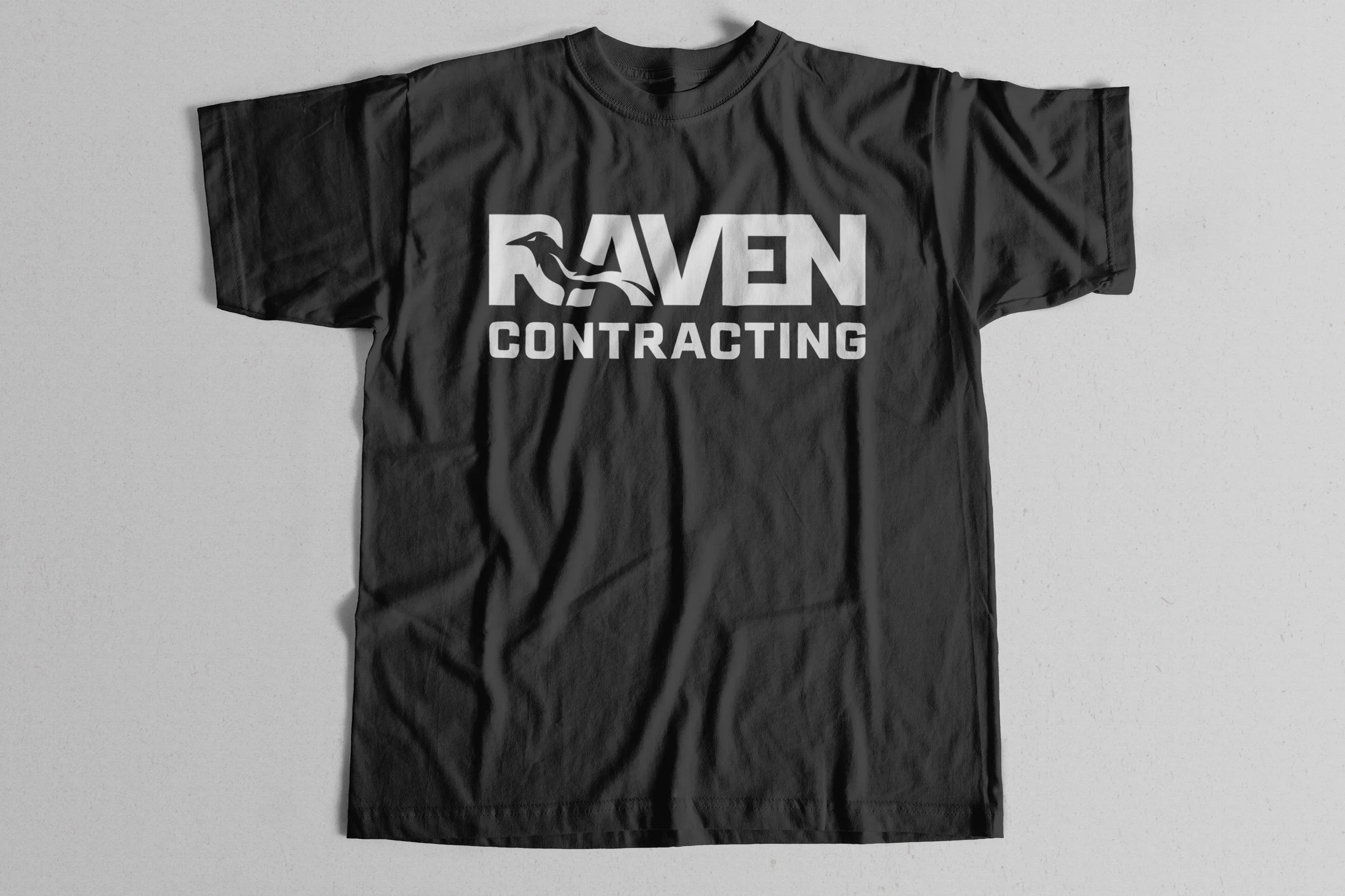
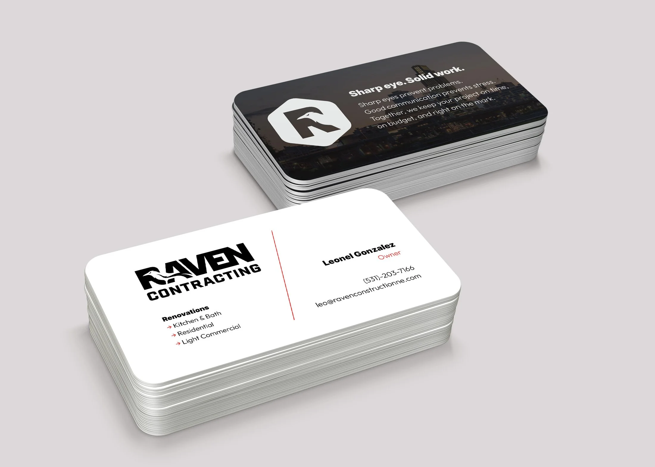
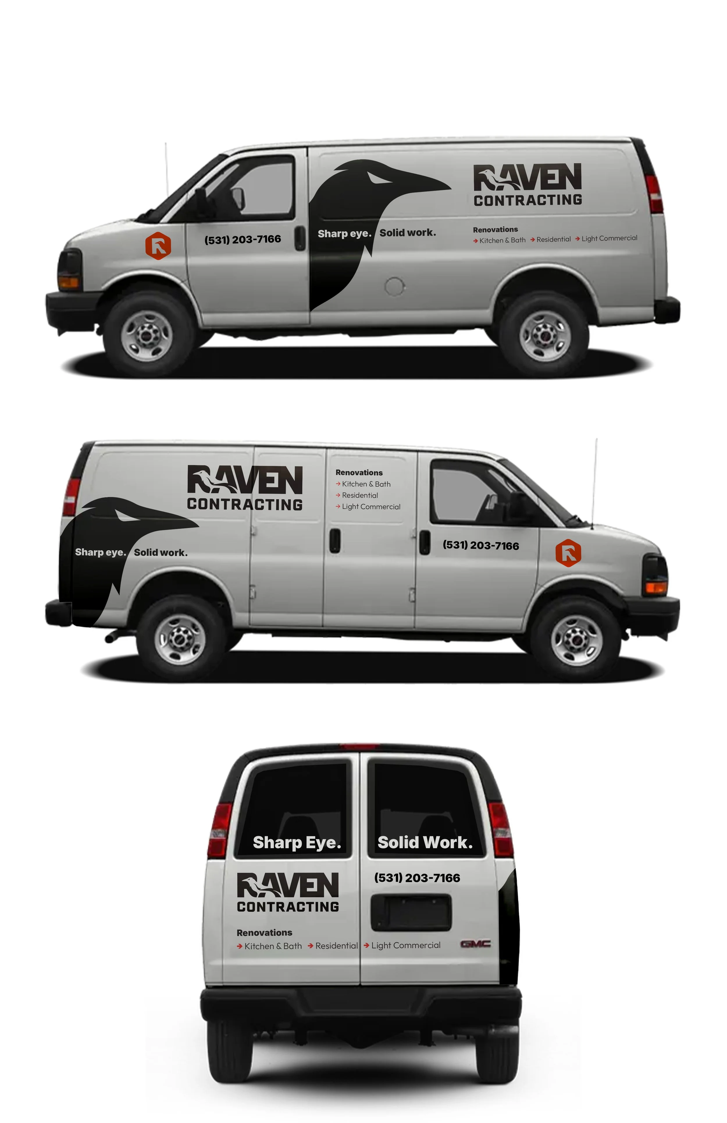
The new identity focuses on what Raven is best known for: sharp eyes and solid work.
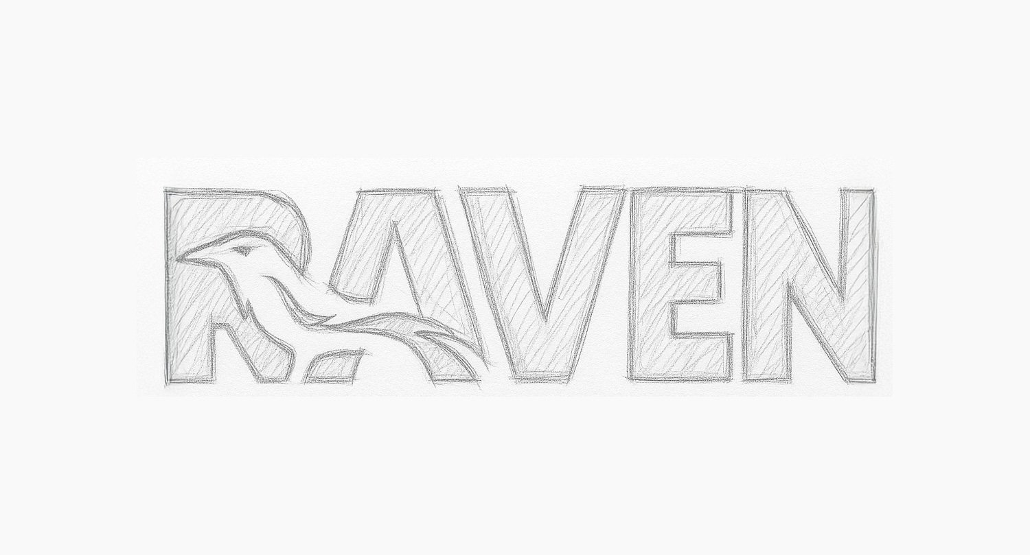
The raven becomes more geometric, more intentional, and more iconic. Instead of jagged edges and distressed outlines, the new silhouette uses purposeful angles and balanced forms—still fierce, still recognizable, but now timeless and usable at any scale.
The wordmark underwent the biggest transformation. Where the previous typography leaned heavily toward stylized, uneven letterforms, the new logotype embraces clarity and strength. Cleaner geometry. Even spacing. A visual rhythm that reflects the way Raven builds: carefully, methodically, with confidence.
Most importantly, the brand narrative matured.
Raven isn’t just a contractor—it’s a crew defined by attention. They catch mistakes before they happen. They explain the “why,” not just the “what.” They deliver projects clients brag about. The refreshed messaging system captures that in language that’s clear, human, and grounded in day-to-day reality.
The end result preserves the spirit of where Raven started—just without the noise. A brand that’s sharper, steadier, and built to last.
Outcome
The new system doesn’t erase their grit; it refines it. It takes the intensity of the old brand and channels it into something more confident and enduring—an identity that finally matches how Raven actually builds.
The result is a mark that feels inevitable once you see it: recognizable at a glance, grounded in craft, and strong enough to scale as the company grows.
Impact
The rebrand gave Raven something invaluable: a brand that works as hard as they do. Clients immediately recognize the elevated professionalism, and long-time partners see a clearer expression of what has always set Raven apart—their eye for detail and their commitment to doing things right.
Brand 10%
Sharp eyes prevent problems. Good communication prevents stress. Together, we keep your project on time, on budget, and right on the mark.Brand Promise
Raven Contracting blends sharp attention with a people-first approach. We don’t rush, guess, or leave you in the dark — we walk you through the details, and double-check the work. That means fewer surprises, and a finished project you’ll want to brag about. Clients don’t just love the results; they love the experience of getting there.