

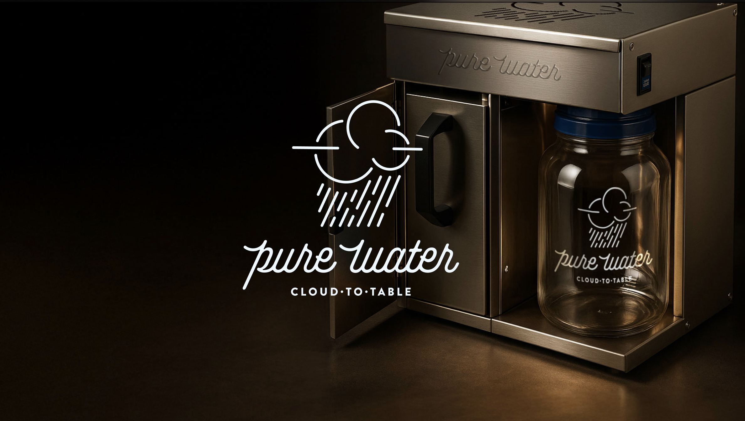
Making the Complex Purchase Feel Simple
Pure Water Website & Customer Experience
Challenge
Pure Water has spent more than 55 years building some of the best water distillers in America. The challenge wasn't the product. It was helping customers understand it.
Water purification is a surprisingly complex purchase. Customers arrive with questions about contaminants, distillation, filtration, capacity, maintenance and cost—then encounter several machines that, to an unfamiliar buyer, can look remarkably similar.
The existing website had accumulated years of valuable information, but that information was competing with the buying journey. Visitors were often asked to learn before they had a clear sense of what Pure Water offered, which product was right for them, or why an expensive distiller was worth the investment.
Let’s simplify the experience without simplifying the product.
Approach
We started with the customer journey rather than the sitemap.
A good ecommerce experience shouldn't simply contain the right information. It should reveal that information in the right order. That distinction shaped the entire project.
Instead of leading with education, we brought Pure Water's products and value proposition forward. Visitors could quickly see the primary residential systems (which fit their consumer-first marketing strategy) understand who each was designed for, compare their differences, and move confidently toward the product that fit their needs.
Education didn't disappear. It moved to where it could do more good.
Once visitors understood what they were considering, the site could answer the natural questions that followed: Why distillation? Why Pure Water? What can I use distilled water for? Why does this cost more than a filter? Can I trust this company?
The result was less a collection of webpages and more a guided conversation.
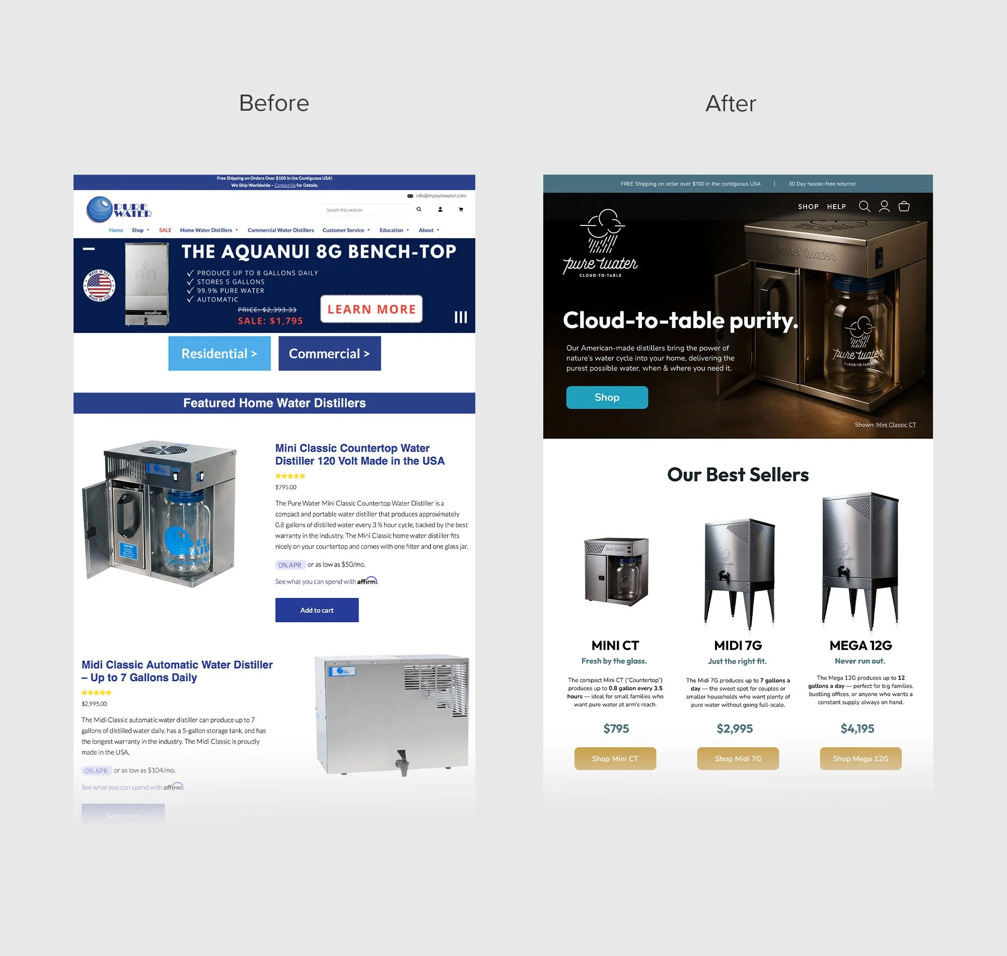

Designing Around Decisions
The homepage was rebuilt around a simple question:
What does a customer need to understand next?
The experience begins by establishing the product and its promise, then introduces Pure Water's best-selling systems with simple, human distinctions.
From there, a comparison experience lets visitors evaluate the Mini, Midi and Mega systems without repeatedly jumping between product pages.
Only after establishing those choices do we deepen the story—Pure Water's decades of experience, American manufacturing, stainless-steel construction, customer support and warranty; the everyday uses for distilled water; the Cloud-to-Table process; reviews and recommendations; and finally the people and place behind the products.
Each section has a job.
And each one prepares the visitor for the next.
Product Pages That Sell
The same philosophy became even more important on individual product pages.
A customer considering an $800 appliance — or a several-thousand-dollar whole-home system —needs more than specifications. They need confidence. So we designed product pages to answer questions in roughly the same sequence a good salesperson would.
What is it?
A concise introduction establishes the product, price and intended customer.Why might it be right for me?
Key benefits translate specifications into useful reasons to buy.Will it fit my life?
Dimensions, production capacity, maintenance and everyday applications make ownership easier to imagine.Why distillation?
Education explains the technology after interest has already been established.Why should I believe you?
Comparisons, reviews, longevity, warranty and the Pure Water story reduce the perceived risk of a significant purchase.What happens after I buy it?
Parts, guides, videos and maintenance information reinforce that Pure Water isn't selling a disposable appliance. It's supporting a product designed to last for decades.The goal wasn't to make the page shorter simply for the sake of being short. It was to make a substantial amount of information feel easy.
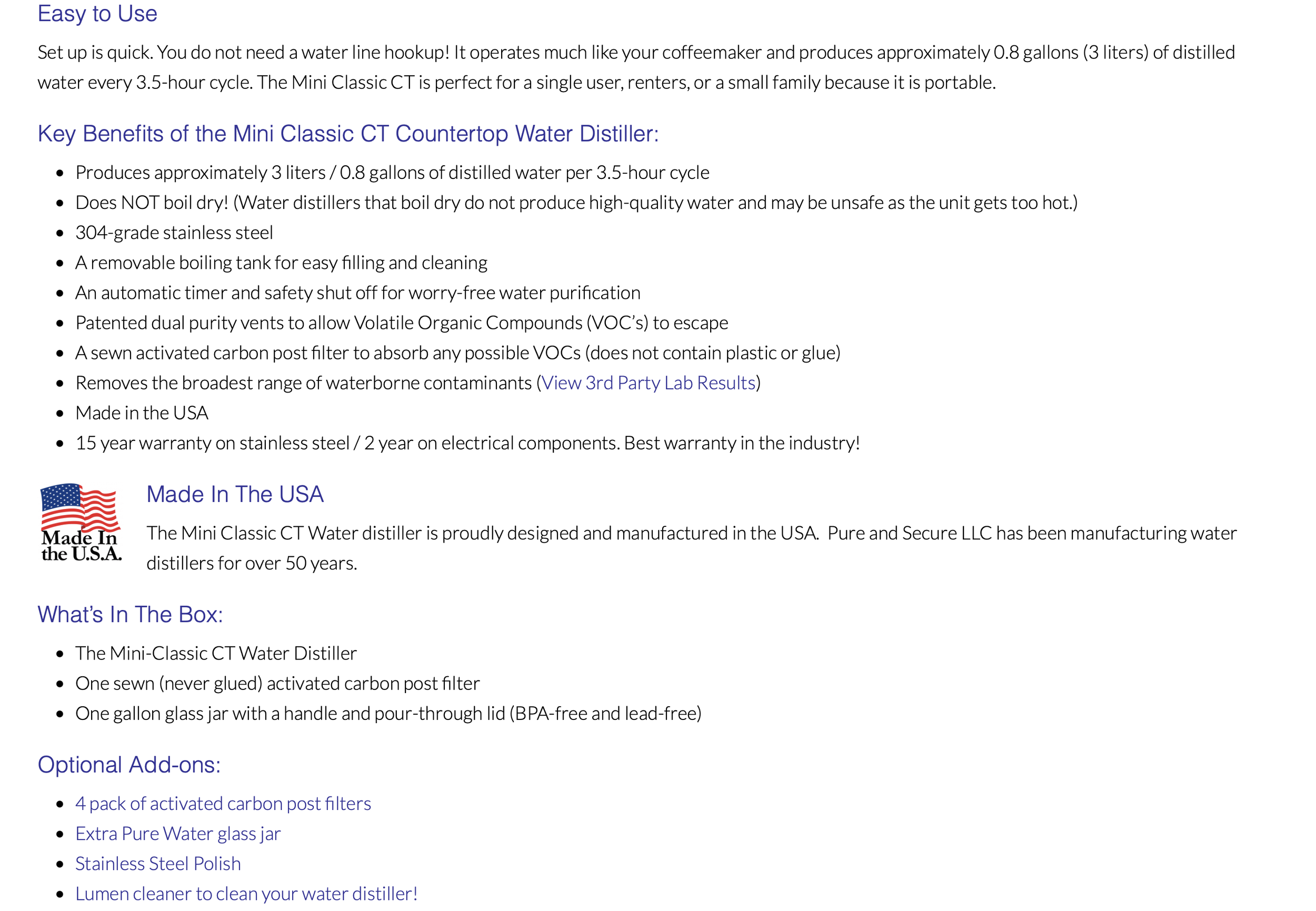
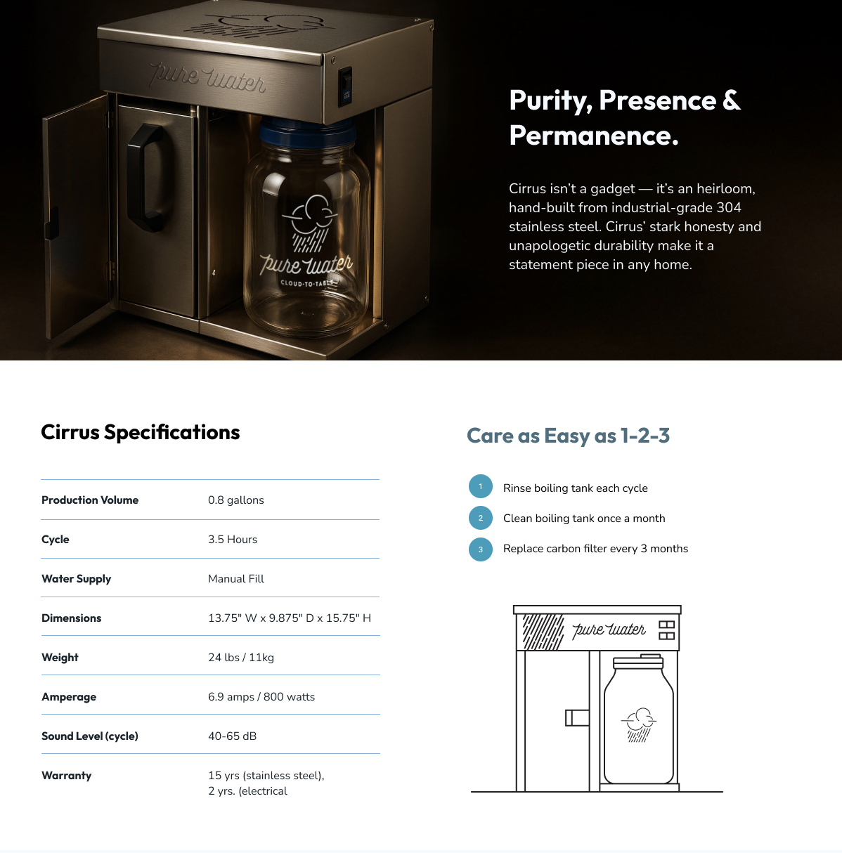
In the above example, product info was chunked thoughtfully for optimal customer digestion. We also consulted on product naming, with the goal of establishing a consistent “cloud based” theme throughout the line of core products. Further, we consulted on industrial / product design to bring the new brand scheme into the stainless steel casing while also improving the functional cooling elements of the design.
Clarity Builds Trust
Our original UX review uncovered another important issue: tone.
When a product relates to something as fundamental as drinking water, it's easy for marketing to become alarmist. But fear can create urgency at the expense of trust. We recommended moving away from panic-focused messaging and toward calm confidence.
Rather than telling customers what to be afraid of, the new experience helps them understand their options and make an informed choice. That philosophy extends to the writing itself: fewer exclamation points, less sales language, shorter explanations and clearer statements.
A premium product doesn't need to shout.
Brand and UX: Better Built Together
Although this project centered on the digital experience, UX doesn't live in isolation.
Alongside the website work, we helped Pure Water clarify its broader brand presentation and develop the Cloud-to-Table™ idea—a simple expression of the sophisticated natural process behind distillation. That work gave the website better raw material to work with.
It's one reason we often advocate developing brand strategy and digital experience together. A beautiful interface can't compensate for an unclear message, and great positioning loses much of its power when the customer has to fight through a website to understand it.
Brand defines the promise. UX makes that promise easy to experience.
Outcome
The redesigned MyPureWater.com transforms a complicated category into a more natural buying experience.
Customers can quickly understand the product family, identify the system that fits their needs, compare meaningful differences, learn why distillation works, see how it fits into everyday life, and find the evidence they need to make a confident purchase.
The information was largely there all along. Our job was to understand the customer well enough to know when they needed it.
Impact
Good UX isn't about making things pretty or making every page shorter. It's about removing unnecessary decisions, answering questions before they become objections, and creating momentum from curiosity to confidence.
For Pure Water, that meant turning decades of product knowledge, credibility and technical information into a digital experience that works more like their best salesperson